In review of Lesson I, we talked about the project and setting up the tools needed. In Lesson II, Part I we learned how to build the skin’s interface.
In this lesson we’re going to have some fun building the buttons. It’s a bit long, so sit back and take your time.We’ll be building all the graphic elements from scratch using Flash. As mentioned in the earlier lessons, if you’re not comfortable building graphics from the ground up, don’t worry. It’s simple and I’ll walk you through every step. If you’re still a bit intimidated by building graphics in Flash, I’ll show you how to import existing graphic elements such as pre-made buttons in the next lesson. Although these will be very basic and easy to build, the techniques learned can be applied to any number of possibilities.
Note: I’m using Windows. I’m saving my pennies for a Mac but in the meantime when I refer to ‘right-click’ you Mac users will press the CTRL key + click.
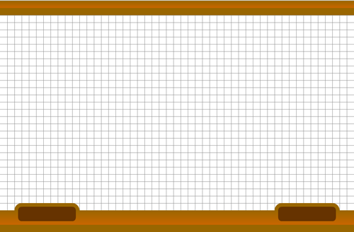
To get started, open your .fla we worked on in Lesson II, Part I. Your stage should look like this (with gridlines turned on):
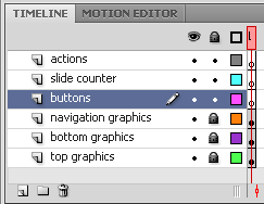
To get started, select the Buttons layer and ensure all the other layers are locked.
I. The Button Symbol: Up, Over, Down, Hit
![]() We’re going to move right into building a button symbol. Planning ahead by having the buttons layer already selected, we’ll be able to drop them into place.
We’re going to move right into building a button symbol. Planning ahead by having the buttons layer already selected, we’ll be able to drop them into place.
Creating the button symbol
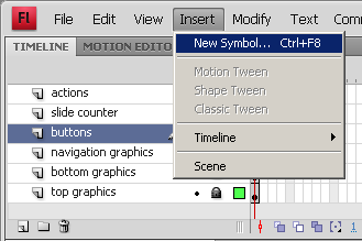
On the file menu select Insert > New Symbol... Or press CTRL + F8
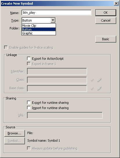
The Create New Symbol dialog box will appear. There are two things we need to do in this box – Name: and Type: For this example, I am naming it btn_play. For the Type:, choose Button.
Note: naming your buttons with either the full description “button” or “btn” will ensure ActionScript picks up the actions we will eventually apply to it.
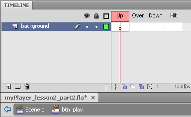
Your stage should be blank and the timeline should change to the buttons timeline. Notice at the bottom of the timeline shows where you are in the project with the scene icon and the button icon: Scene 1 > btn_play (where ‘btn_play’ is the name we gave our button).
Rename Layer 1 to background.
A quick overview of the button states:
- Up – the position the button is in during its resting state.
- Over – the state the button changes when the mouse is rolled over it
- Down – the state the button changes when clicked
- Hit – the area in which the button will be activated when clicked.
Creating the button background
A button can have any number of layers and frames. You can also create other animated Movie Clips for the different states. For instance, you could have an animation occur when the mouse rolls over the button. For this example, we are going to keep things nice and simple.
Once we get this button constructed, the others will be a synch! First, we need to create the background for our button.
Note: I use backgrounds that, in the end, appear to be a border. I do this because when resizing the end symbol, a vector shape will maintain its dimensions whereas the border thickness would have to be resized independently.
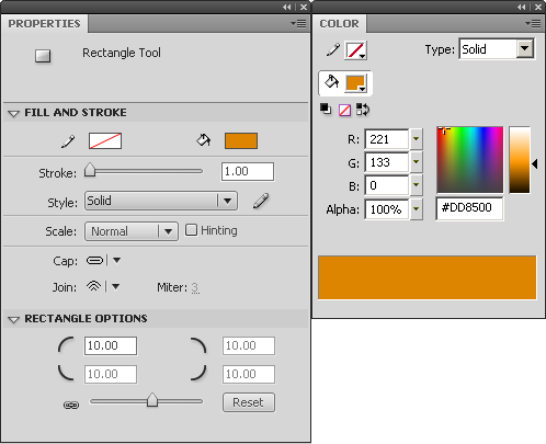
Select the Rectangle Tool. We want a rounded rectangle, so set the Properties > Rectangle Options to 10.00. For the Color and for this example, I chose to set the background color to orange or #DD8500.
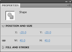
Draw the rounded rectangle anywhere on the stage. Set the size as W: 40px and H: 40px.
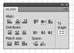
You can either use the Align tool to center the rounded rectangle or simply set the X: and Y: positions to -20.0
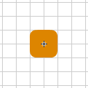
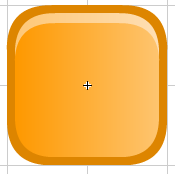
Your rounded rectangle should be nicely placed on the center of the stage something like this.
If you recall, the center play button is much bigger than this. Yet, all the other buttons on the bottom navigation are the same size. One of the advantages of building buttons directly in Flash is because they are vector shapes. Meaning, we can resize them and not lose any quality.
Since we will be using this button as our foundation for all the others, we want it to be the size of those buttons. We just need to increase the size of this button when we place it on the main timeline.
Okay, that all being said we need zoom in to continue working. The bigger the better! Zoom in to a size based on your screen resolution where it is a comfortable working size. 400% or 800% works best for me.
Creating the button reflection layer
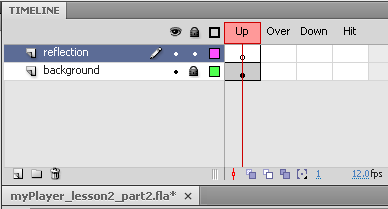
Add a new layer. Change the name to reflection.
The reflection shape is made up of three parts: The center gradient, top and bottom highlights. To create the reflection we are going to do several things.
Creating the Center Gradient
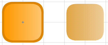
First, the center gradient is nothing more than a copy of the background shape with a different color, gradient, and slightly smaller.
Select the shape on the background layer > copy > paste in the Up keyframe on the reflection layer. Now lock the background layer so we don’t mess things up.
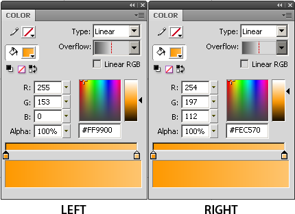
With the new shape still selected in the reflection layer, change its Color properties to the following:
Type: Linear
For the LEFT Color: #FF9900
For the RIGHT Color: #FEC570
With the shape still selected, in the Properties change the W: 36 and H: 36. Finally, center the shape with the Align tool which should place it at X: -18.0 and Y: -18.0
With both the background shape and the center gradient shape of the reflection layer visible, you should have something that looks like this (at 400% zoom).
Creating the top button highlight
There are multiple steps here so take your time. We’re going to use a portion of the stage as a workbench to build the highlight shape we need.
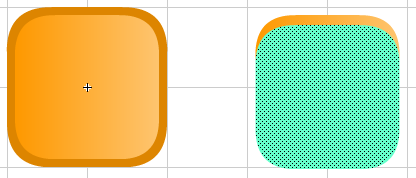
Ensure the reflection layer is selected and then select the center gradient. Copy (Ctrl + C), Paste (Ctrl + V) and move the new shape off to the side.
These next steps are done in sequence:
- Paste again (Ctrl + V).
- Select the paint bucket and change this second shape’s color to any color – we wil delete it shortly.
- Move the new colored shape over to the exact location (use arrow keys or change x, y position) as the previous shape.
- Move the new colored shape down about 3-4 pixels. I just used hit the down arrow 10 times at 400% which changed the y coordinate from -18px to -15.5px. Your results may vary.
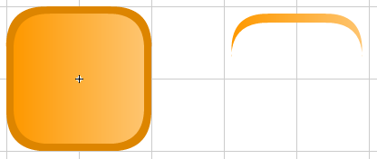
Next, click anywhere on the stage to de-select the shapes. Then re-select the colored shape and delete it. The two shapes are on the same layer and on top of each other, so once you click away they sort of fused together. By deleting the top shape, it also deleted everything below it leaving just the sliver of a shape we need for our highlight.
Changing the color gradient of the highlight
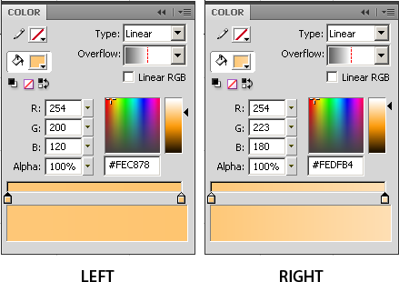
Now that we have our highlight shape, let’s lighten it up a bit. Select the new sliver shape and in the Color palette, change the left and right gradients. Simply slide the small black triangular arrow on the right up to lighten the existing left color. Do the same for the right and slide the arrow to an even lighter shade. There is no science or skill to this – just use the slider to select two lighter colors than the main center gradient that you like.
The last step is to move the new highlight shape back on top of the main center gradient shape. Select the highlight and press the left arrow key until it is centered on the main shape. You can also use the Align tool and simply click the align center button.
Creating the bottom highlight
Now that we have the top highlight ready to go, making the bottom highlight is a snap. Select the top highlight, Copy (Ctrl + C) and Paste (Ctrl + V).
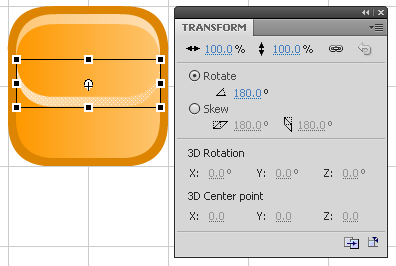
With the bottom highlight still selected, open the Transform tool and rotate the shape 180 degrees.
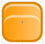
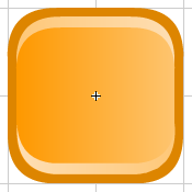
Next, use the down arrow key to position the shape at the bottom of the main center gradient. The end result should look something similar to this:
Creating the Play icon shape
Lock both the background and reflection layers. Create a new layer and label it icon.
Just like building the highlights, we’re going to use a portion of the stage again as a workbench. There are unlimited number or ways to do this, but for simplicity we will just make a quick shape to represent the Play icon.
1. Select the Rectangle too
2. Choose any color other than white.
3. In the Rectangle Options, enter 5.00 for the roundness.
Draw a 30px by 30px shape off to the side of the main button.
Select the Free Transform Tool (Q) and rotate the shape 45 degrees.
Use the Selection Tool (V) and select roughly half of the shape.
With half of the shape still selected, press the delete key.
With that shape still selected, lock the aspect ratio in the Transform tool and reduce its overall size to 65%.
Again, with the shape still selected use the Align tool to center it onto the main button shape. It may look as though it is not truly centered, but it is due to the illusion of a sideways triangle shape against a square shape. I nudged mine just a bit back to the right using the right arrow key at about -5.0px.
Last step is to change the color. In this example, let’s just stick with white. The final button with all three layers should look similar to this:
Creating the remaining button frames
As mentioned at the begging of this tutorial, a button has four states: Up, Over, Down, and Hit. All the work we’ve done up to this point was working on the Up state. Now we will create the remaining Over, Down, and Hit states.
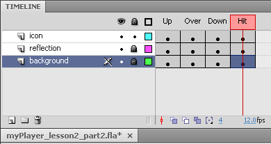
Select the Up frame of the icon layer. Press the F6 key (insert keyframe) three times. This will copy the Up frame across the other three state frames.
Do the same for each of the reflection and background layers.
Not much has happened at this point other than copying all the shapes across each of the states. However, we want the user to experience a slight difference when interacting with the button – specifically the Over and Down states. As I indicated earlier, there are an unlimited number of things you can do to these states including additional animated movie clips. For this example, we will only be adjusting the Down state.
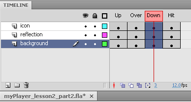
Unlock all of the layers. Select the Down keyframe in the icon layer and drag down to the background layer until all three Down keyframes are selected as shown below.
By doing this all graphic elements on the stage are now selected and can be moved all at once. Imagine for a moment when you click a button. Sometimes it might glow, move, shrink, grow, etc. In this example we simply want to nudge the button off center to the right and down. When a user clicks the button it will appear as it is being pressed down.
With all the keyframes selected in the Down state, use your arrow keys to move all the shapes at once to the right. Then the same amount down. At 400%, I pressed the right arrow key three (3) times, and the down arrow key three (3) times.
To test, reduce the stage back to 100% and drag the red indicator along the timeline across all button states. Watch as you pass over the Down state. If it is not what you want, keep adjusting until you get an action you want.
Note: The Hit state in this button is virtually useless as the background shape covers the entire clickable surface. The Hit state comes in handy when you want to create a button from text where you would place a shape the size of the text box on that keyframe. This ensures no matter where a user clicks, the button will activate.
II. Duplicating Button Symbols
The hard part is over. From here on out, the remaining buttons for the player will be fairly simple to create. We will copy the button you just created and only change the icon layer.
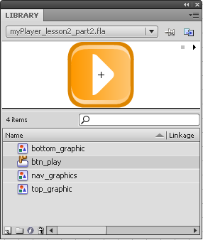
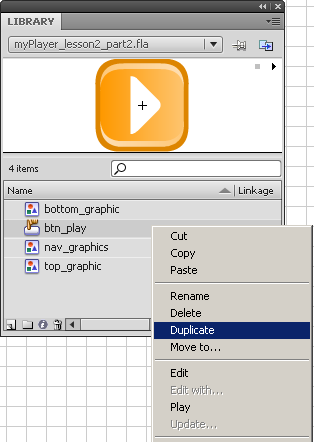
First, let’s get things set up in the Library. Open your Library panel if it is not already open by going to Window > Library. Your Library panel should look something like this:
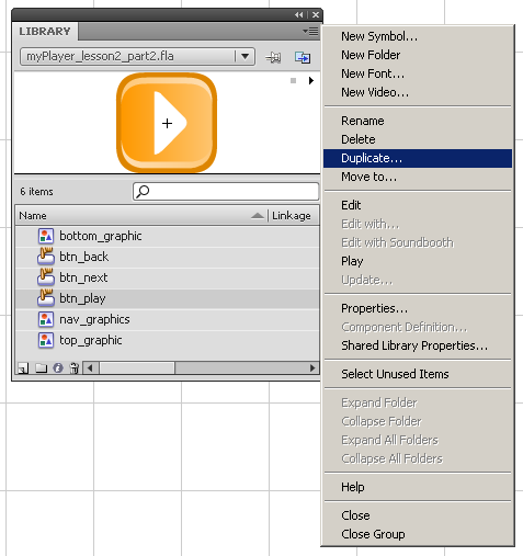
Notice the only button we have in the Library is the ‘btn_play’ Button. Right-click on the Button and select Duplicate (image 1), or click the menu dropdown in the upper right corner of the Library window and select Duplicate (image 2)
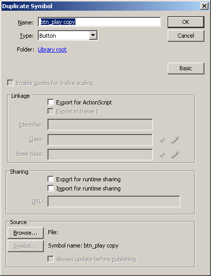
The Duplicate Symbol dialog window will appear with the Name already filled in of the existing button plus the word copy. Change the name to btn_next and click OK.
For this example, we need to make five more buttons in addition to the Play button:
- btn_next
- btn_back
- btn_pause
- btn_audioON
- btn_audioOFF
You can name them whatever you choose, but the above name is simple and keeps everything nice and neat. Now, the first thing that comes to mind is simply making five copies of the existing button, but there is a bit more we need to do for each button. So let’s just do one at a time.
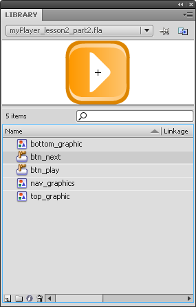
After copying the Play button and renaming it ‘btn_next’ your Library should now look like this. But notice with the newly copied button selected, it still looks like the Play button. We need to make changes to this button before continuing.
Editing the btn_next button
![]() Double-click the newly copied ‘btn_next’ symbol. If your stage is not still at 400%, go ahead and zoom in now.
Double-click the newly copied ‘btn_next’ symbol. If your stage is not still at 400%, go ahead and zoom in now.
Lock the reflection and background layers. Next, follow these three simple steps:
- Select the arrow graphic on the icon layer.
- Copy and Paste the icon graphic and nudge to the left to your liking.
- Click away to deselect the copied arrow graphic. Reselect it and it should now be merged as one double-arrow graphic. Nudge it back over to center to your liking.
We’re almost there. Although we have edited the arrow graphic to now indicate a double arrow, we only edited one button state – the Up state. We still need to edit the other three button states.
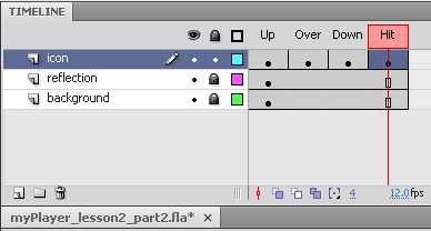
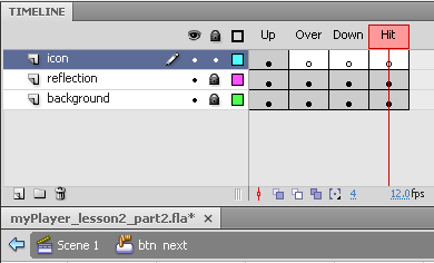
Select the Over state frame and hit delete. Do the same for both the Down and Hit states. Your timeline should look like this:
Next, click the Up frame in the icon layer to select the newly created double arrow graphic on the stage and copy it. Then, click the Over state keyframe in the same layer and Paste in Place (Ctrl + Shift + V). Do the same for the Down and Hit states.
There is one last thing we still need to do. Remember the Down state the button moves off center slightly. We need to also move the graphic on that state to match that movement. Select the Down state keyframe and select the double arrow graphic on the stage. Use your arrow keys to move the graphic to the right and down. As before at 400%, I pressed the right arrow key three (3) times, and the down arrow key three (3) times.
All done. Now we apply these similar steps to the remaining buttons with slightly modified graphics.
III. Other Buttons using same graphic
Now that the first duplicated button is complete, we will continue to use the same button to create the other four buttons we still need.
Editing the btn_back button
![]() The next and back buttons are very similar. All we have to do is flip the double-arrow. Duplicate the newly created ‘btn_next’ by using one of the two methods explained earlier and rename it to ‘btn_back.’
The next and back buttons are very similar. All we have to do is flip the double-arrow. Duplicate the newly created ‘btn_next’ by using one of the two methods explained earlier and rename it to ‘btn_back.’
- In the Library window, double-click the newly created ‘btn_back button.
- Select the double arrow graphic on the icon layer.
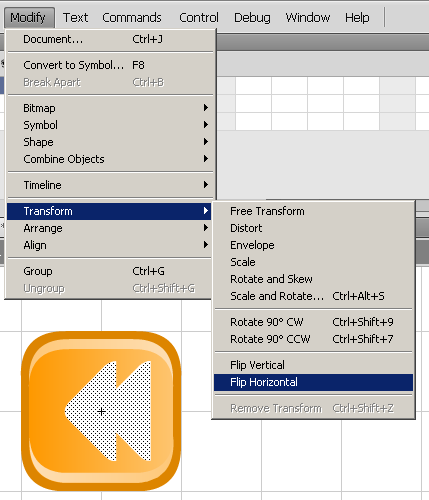
- In the top menu bar, select Modify > Transform > Flip Horizontal
- Nudge the flipped double arrow back to center
btn_back with double arrow graphic flipped horizontal prior to being nudged back to center
Similar to the previous btn_next, we need to copy the flipped arrows across the other button states. Click the Up frame in the icon layer to select the newly created double arrow graphic on the stage and copy it. Then, click the Over state keyframe in the same layer and Paste in Place (Ctrl + Shift + V). Do the same for the Down and Hit states.
Again, remember that in the Down state the button moves off center slightly. We need to also move this graphic on that state to match the movement. Select the Down state keyframe and select the double arrow graphic on the stage. Use your arrow keys to move the graphic to the right and down. As before at 400%, I pressed the right arrow key three (3) times, and the down arrow key three (3) times.
Editing the btn_pause button
![]() The btn_pause graphic is quite different than the previous two, but the button itself is the same. It doesn’t matter which button you duplicate at this point as we will be changing the graphic. To keep it simple, duplicate the previous btn_back button and rename it to btn_pause.
The btn_pause graphic is quite different than the previous two, but the button itself is the same. It doesn’t matter which button you duplicate at this point as we will be changing the graphic. To keep it simple, duplicate the previous btn_back button and rename it to btn_pause.
Double-click it open it on the stage. Before we can create the graphic for this button we need to delete the double arrow graphic. Since it resides on the four button state frames, we need to delete each one.
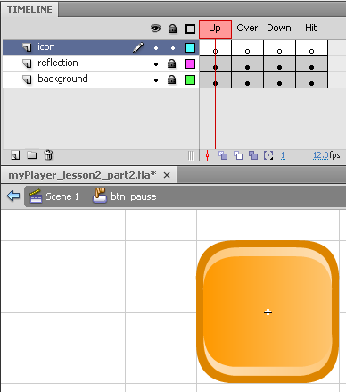
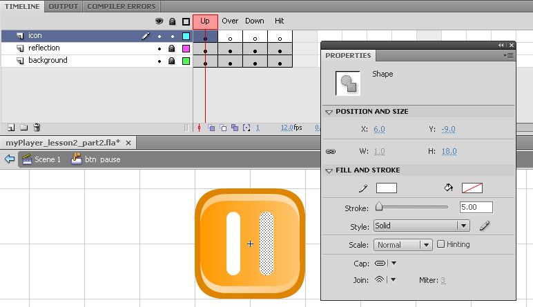
Your timeline and stage should look similar to this:
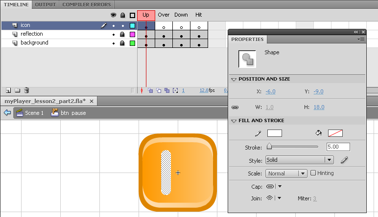
Okay, this is really simple. Select the Up state keyframe and select the Line tool. Draw a small vertical line and in the Properties panel, set it a height of H: 18.0.
Use the Align tool to center it on the button, and then nudge it over to the left. In this example you see I moved it off center X: -6.0 or one third the distance of its height.
Copy this shape, paste it, and nudge it back over to the right of center to X: 6.0 like this:
Now, simply select the keyframe to select both shapes, copy, and paste in the Over and Down keyframe states. Remember on the Down state to nudge it over to the left and down as the main shape.
Editing the btn_audioON and btn_audioOFF buttons.
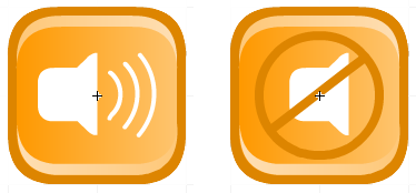
Both of these buttons use the same main shape. However the ON button has audio waves where the OFF button has the universal not symbol.
Creating the btn_audioON
![]() First we need to duplicate an existing button. Open the Library panel and duplicate the btn_play button. We’re going to use that graphic shape as the starting point for the audioON graphic.
First we need to duplicate an existing button. Open the Library panel and duplicate the btn_play button. We’re going to use that graphic shape as the starting point for the audioON graphic.
Remember, a little house maintenance before we begin. Lock the reflection and background layers, and on the icon layer delete the graphic on the Over, Down, and Hit keyframe states.
1. Select the Up state keyframe to select the graphic.
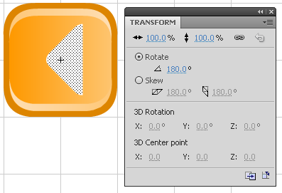
2. Open the Transform tool panel and rotate the graphic 180 degrees like ths:
3. Select the Rectangle Tool (R) and set the Rectangle Options 5.00 for rounded corners.
4. Draw the shape near the existing shape and then use the Align tool to position it where you like.
5. In order to draw the audio waves we need to reduce the overall size of the new “speaker” graphic.
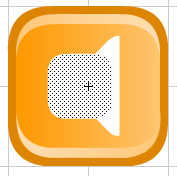
6. Select the Up state keyframe to select the newly formed graphic. Open the Transform tool and reduce the size to 75% of its original.
To create the audio waves, we need a blank area of the stage to work in. Once the audio waves are created, we’ll move them over to the speaker graphic. This is a series of steps so you may not like the results your first time through. Just take your time and learn the tools, and you’ll get the graphic you’re wanting.
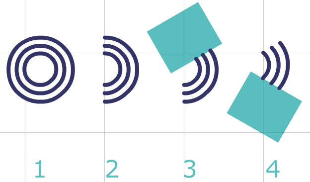
This image represents the next four steps:
- CREATE CIRCLES
- Select the Oval Tool (O) and choose a darker color for the line.
- Draw a 8.0 px by 8.0 px circle.
- Copy and paste the circle, and then open the Transform tool. Increase its size by 125% Place it over the smaller circle.
- Copy and paste the second circle and increase its size to 135%, and place it over the other two circles.
- CUT IN HALF
- With the Selection Tool (V), select the left half of the three circles and hit delete to form three half circle lines.
- TRIM TOP
- Select the Rectangle Tool (R) and choose a different fill color.
- Draw a small rectangle. Open the Transform Panel and rotate the it -30 degrees.
- Place it on top of the upper portion of the three lines. Deselect, re-select, and hit delete.
- TRIM BOTTOM
- Select the same rectangle shape as in the previous step and rotate it back the other direction to +30 degrees.
- Place it on the bottom portion of the three lines. Deselect, re-select, and hit delete.
- Delete the rectangle.
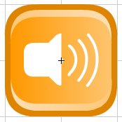
Now, select all three line, change their line color to White, and move them over to the speaker graphic. You may need to adjust the size of either the speaker or the lines so they balance proportionately. The end result should look something similar to this:
Don’t forget to fill in the remaining button states.
Creating the btn_audioOFF
![]() In the Library, Duplicate the btn_audioON button and rename it to btn_audioOFF. Double-click the btn_audioOFF button to edit.
In the Library, Duplicate the btn_audioON button and rename it to btn_audioOFF. Double-click the btn_audioOFF button to edit.
As before, delete the Over and Down button state keyframes.
The audio waves were a little bit more complex in building than this next piece. As a design choice, you can either leave the audio waves for the OFF button or not. I chose to delete them and then center the speaker graphic as in Step 4 of creating the btn_audioON graphic.
- On a blank section of the stage, select the Oval Tool (O).
- Fill color blank
- choose any color for the Line. I chose the same color as the button border: #DD8400.
- Stroke: 2.00 pixels
- Draw a circle at Height: 27.0, Width: 27.0
- Select the Line Tool (N) and draw a diagonal line across the circle.
- With the Selection Tool (V), center align the circle/line over the main graphic.
- Copy and paste into the Over and Down keyframe states. Don’t forget to nudge the Down state down and to the right a bit.
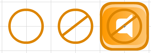
Shown below are Steps 2-4. Your button should look something similar to this:
Putting it all together!
That’s it! We have all the graphic assets we need to finish building a basic custom player. In the next lesson, we’ll get all these newly created buttons placed on the skin and assign them instance names in preparation for the ActionScript.
Thanks for reading! And be sure and leave me any comment if my sequencing is off or you have suggestions for a better tutorial. Oh, and writing is not my strong suit, so any grammatical errors, please don’t hesitate to let me know!

Great post Kevin! Really in-depth.
Thanks Dave! You do realize this is all your fault, right? 🙂
Thanks! I’ll be wait for next lesson!
Hey,
These are really awesome! When can we expect the next lesson to come out?
Thanks Michelle! I’d like to say soon, but my track record for finishing this series has gone far beyond what I had intended. I will certainly let you know when the next one publishes.
Great stuff. I am also waiting to see the next one. Sort of like a great cliff-hanger novel…really want to know how it ends…
Ha! Thanks Noah! Never thought of it as a cliff-hanger. Now that you said that, maybe I should have alternate endings to the suspense.
Your welcome Kevin. It is really interesting how you went so deep on everything. I definitely agree with this approach as I have also read many tutorials that caused me to have to go read other tutorials. Thanks for making the extra effort.
Any idea when you will get to the next lesson? I am very interested since yours is the best tutorial I have found to date on this subject.
Hi Noah, sorry for delay in replying…
Thanks for the kind words. And I can very much relate to you in regard to reading other tutorials that are not very clear. I write mine from the angle if I know nothing about the subject an am reading it for the first time.
I’m outlining the remaining tutorials for this series now. With so many projects on my desk, I started this one without a clear plan, so I’m fitting it in where I can. Lesson learned for sure!
Thanks again!
This is fantastic! How do I code the buttons? Where’s the XML file? I have a hundred additional questions…
Will those be answered in a future post?
Hey Ted,
The button code is the next lesson. The next lesson is a challenge of finding time to write it. Email me with your questions and I’ll try to answer them there best I can.
you can’t continue.
Why?
greetings!, i know use flash, i need to know how export the console for import in storyline (the final step) please!
Hi Cristian,
Unfortunately, this method is for the older version of Articulate Studio ’09. The new Studio ’13 is quite different.
hi how can import flash design into articulate storyline 2 file
I don’t use Storyline 2 any longer. If I recall, Insert tab > Flash object