So you’re charged with developing an eLearning course. You set off with great enthusiasm and gusto! You’ve done the analysis, worked with the best SME one could ask for, and have a world class storyboard. You have designed a winner! Now what? You’re not done because now it’s time to develop the visual pieces – the visual part of the instructional design process. Some may mindmap along the way and gather assets to flush out a theme, but in most cases the visual design doesn’t get much attention. Probably because it is such an afterthought that by the time the project gets to development, the deadline is looming and the visuals get rushed. In the end, all the award-winning work you’ve put into this project turns into the same click-n-read cookie-cutter course. There’s nothing wrong with that at times, but it’s not the initial vision you had.
Where to find inspiration
Recently, Tom Kuhlmann with the Rapid Elearning Blog talked about challenging himself to find 5 design ideas by flipping through airline magazines while he traveled.
He couldn’t be more spot on with where to look for those ideas! They are everywhere in our everyday lives! We just need to train our brains to keep a keen eye out for them.
I’m a creative guy. I also suffer from a condition I call the “Creative Curse.” Some of you may experience the same curse. Usually, creative inspiration comes fairly naturally but most of the time when I get inspired I just pass it off as “that’s a neat idea…” and move on. Other times when I’m in a pinch and need an idea, I draw a blank and blame the curse. The ultimate curse is when I’m on a roll with a lot of great ideas and have to fight the urge to use them all in one project.
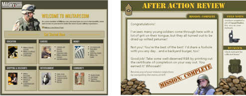
I’m always on the lookout for design layouts that would make a good elearning design. For instance, the inspiration for my Articulate Guru course last year came from a Military.com email newsletter.
On the left is a screen capture of that email newsletter. On the right is a screen from the course.
In this post I want to share a couple of my own recent design inspirations. Both come from an unlikely source…the iTunes app store!
Wunderlist
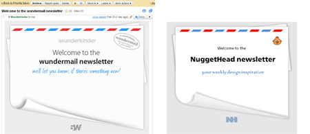
First, is from the iPhone/iPad app, Wunderlist. After downloading the app and registering for an account, I received an email newsletter (seeing a pattern here?…they’re inspirational). The newsletter was in the form of an air mail envelope. I thought it was a clean graphic with just the right balance of the curl and the infamous red and blue air mail border. I haven’t built a template around this yet, but here’s the original email and an image graphic I recreated in PowerPoint that has a similar look and feel.
Creating the curl and shadow in PowerPoint takes a bit of practice and patience.
Watch this quick Screenr on how it was built:
History of Jazz
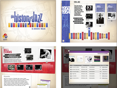
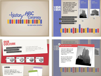
The next design inspiration was a featured app for the iPad back in early February. The History of Jazz – an Interactive Timeline is just that – a journey through history with audio and video of some the greatest Jazz artists. I thought the design was fun, colorful, and well-balanced. Not only did the visuals catch my eye, but I immediately began thinking of ways to use it in an eLearning project. For example, a new hire orientation module for the history of a company.
Below are a few screenshots of the actual app in the app store, and the screens I modeled in PowerPoint after it.


Watch this Screenr on how this was put together:
So let’s see them! Where do you get your design inspiration from? If you find a design for an eLearning project, record a quick Screenr and post in the comments. If you find a design that inspires you, but you’re not quite sure how to recreate it, post the link or send me an email. I’d be happy to help you get started.
Download these History of ABC Company PowerPoint Master Slides. I’d be thrilled to see how you use it in a project!


I couldn’t agree more Kevin. It really does matter what your courses look like. I’ve posted on this before ( http://tmiket.wordpress.com/#!/entry/545 ) and included a study about how looks impact credibility. I think we can learn a lot from advertisers and marketers. They are the definition of communicating succinctly, clearly, and visually. And I’ve yet to see the 1st bullet point in them.
Great post Kevin and thanks for sharing your ideas. I love what you did with the history of jazz theme. One thing I’ve learned from Tom’s blog in particular is to look at designs you like and try making your version in power point. It’s amazing how much you can learn from it.
Thanks Joe! Now here’s your challenge: Apply the ‘History of Jazz’ template into your Bed Bug project! THAT I’d love to see!
Seriously, Tom does a great job at getting his readers to look at the simplicity of design and think about visual cues and what’s appealing rather than stock PPT templates. Hopefully, I’ll be able to share more of my ‘inspirations’ soon.
Hey Kevin, here are some places I look for design inspiration in no particular order: NoteandPoint.com , Slideshare.net , stocklayouts.com , and of course the Articulate community at http://community.articulate.com/
Hey Kevin, here are some places I look for design inspiration in no particular order: NoteandPoint.com , Slideshare.net , stocklayouts.com , and of course the Articulate community at http://community.articulate.com/
Ditto! Thanks Mike. You’ve given me yet another inspiration…to write a post about great inspirational sites that offer ideas for elearning.
Great minds think alike! I had forgot about BJ Fogg. I recall seeing that but had forgotten where. Thanks for reminding me…and sharing the link to the slides.
Also, to your point in your blog post we can learn a lot from marketers regarding visual layout. There are so many correlations between web design and elearning that as IDers we should spend as much time looking at usability, navigation, and visual design in the web industry as much as we do hunting for stock photos and fancy fonts!
Thanks for stopping by!
Hi,
This is santhosh, I learn your lessons for creating custom articulate skin, it was nice. And did you post your lesson III ? if not when can I expect it? pls let me know the regarding…..
Thanks
Hi Kevin,
Admire your creativity+aesthetics+tech=knowledge.
P.S. Do you also see comments being double-posted? Just me? WordPress bug?
Not seeing any double comments being posted. And thanks for the kind words!