In eLearning we are always challenged with communicating a message to the masses. Where one message may read well for one user, that same message is vague to another.
Images, symbols, and graphics can communicate your message more effectively by simply using a combination of dots, dashes, and lines.
For example, lets say we need to communicate the message of time. When you think of the word “time” what visual objects form in your mind? The first thing that I see is a clock. It is the most fundamental object that can visually communicate the concept of time. Of course, the symbol alone will not do you any good unless you have it presented in some context of which your message supports, but you get the idea.
In this post, I’ll show you how to draw a simple clock symbol in just a few minutes using any graphics editing tool. I used Illustrator.
Here’s the breakdown:
1 – line (circles)
6 – lines (straight)
1 – dot
12 – dashes

OK, let’s break it down further. First, draw a circle. The fill is white and the line border is black…keep it simple. Next, copy and paste that circle and reduce it down to the size of a dot and place it in the center of the circle. Change the fill to black with no border color. For the hands of the clock you can do this one of two ways – draw each line (arrow has three lines) one at a time, or draw one arrow with three lines, copy and paste, then shorten the tail of the line slightly to represent the hour hand. Finally, draw a small line (dash) and place it at the 12 o’clock position. Copy and paste it and rotate 15 degrees for the 5 minute placement. 15 more degrees for the ten minute position, so on and so on until you have all the dashes in place to represent the face of the clock. Walla! A clock!
Big deal, right? Let’s take it a step further. When you think of the face of a clock how many objects that communicate time can you think of? The first thing that comes to my mind is a wrist watch. Visualizing further I see a mantle clock, an anniversary clock, and a grandfather clock. There are many more, but for now let’s play with these four.
Now that we have different ideas of how a clock face can be used in the four examples, what emotion or “message” communicates to you when you see a wrist watch? How about a mantle clock? You may have different thoughts on this, but here is what I think of when I see these:
Wrist Watch- schedule, planning, deadline, meeting
Mantle Clock – retirement, center piece, end of an era
Anniversary Clock – celebration, timeless, commitment
Grandfather Clock – reliable, steadfast, passing of time
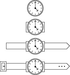
Get my picture? HA! Picture? Get it? I digress…OK, so how do we communicate those thoughts and messages with our simple clock? By adding a few more lines to our clock example we can create all of these symbols fairly simple. Let’s start with the wrist watch…

Neat, huh? By adding 17 more lines, 3 dots and a dash it’s a wrist watch. Here’s the breakdown…first, draw a rectangle and place it behind the clock face (for the strap) – that’s 4 lines. Now draw a long slender rectangle and place it behind both the clock and the rectangle you just drew (wrist strap) – four more lines for a total of 8. Add a vector anchor to the right edge of the rectangle and pull it out a bit and add three (3) dots. (this splits the line into two or if you are not working in a vector program, simply draw two diagonal lines. (that’s really adding only one more line to our total, which is now 9) Finally, draw two rectangles (one on top of the other) and place them on the left edge of the long slender rectangle (buckle) – two rectangles with 4 lines each = 8 and added to our 9 makes a total of 17, yes? Last, add a dash to the buckle. Ta-Da! How cool is that?
By simply starting with a single image/symbol you can create different looks and more importantly communicate different messages. The symbol doesn’t have to look exact like the watch on your wrist, or the clock hanging on your wall. If you show the above symbol to anyone you know and ask them if they recognize it, my guess is they will answer that it is a wrist watch every time. It’s all about visually communicating.
Next, let’s build this mantle clock:

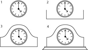
Ok, start with the original clock face. We’re going to add 12 lines. First, draw a rectangle and delete the top line leaving only three lines as shown in image #2. This next line may be a bit challenging for you if you’re not familiar with vector drawing, but do the best you can. The line has three anchor points: one at each corner where you deleted the top line of the rectangle and one at the top center of the curve. Start at one anchor and create and “S” curve, then repeat it in the opposite direction to the last anchor. The base of the mantle is very easy and is only two rectangles. Draw one long thin rectangle and place it at the bottom of the clock. Draw another rectangle slightly taller and place it under the previous one. Next, select the lower right and left anchors and scoot them out just a tad to give it an angled look. And there you have it!
Fun, eh? Now I’ll challenge you again by placing this symbol in front of anyone you know and ask them to tell you what it is. My guess is most folks would simply say a “clock”, but some may actually recognize it as a “mantle clock.” Let’s keep going and build an anniversary clock using the same original clock face. This time we’re going to use elements from the mantle clock…no sense doing more work if we don’t have to!

Before we get started, can you see any similarities between the mantle clock and the anniversary clock. This symbol will have 18 lines total when we’re finished, but many of the lines are carried over from the mantle clock. Remember the three lines of the mantle clock? – left, right, and the top “S” curve line. Let’s look at two ways starting from the mantle clock. 1) Delete the left and right side lines and leave the top “S” curve and the bottom line of the main clock body. Move the clock face and “S” curve higher up from the base of the clock body. Now, move the two anchor points of the “S” curve and join them to the base line of the body. Next, adjust the handles of the two anchors to create a fluid curved line up and over the clock face. You might have to tinker with it a bit to get it even. 2) Another approach is to delete the “S” curve line altogether. Now move the clock face up away from the rest of the elements. Next, simply draw a circle a bit larger than the outer ring of the clock face. Delete the bottom half of the circle. Now extend the side lines of the clock body up to meet the anchors of the half circle. That’s the glass cover. Now let’s turn our attention to the base and the little twirly thing inside.
Your base may be too wide and too thin if you kept it the same as the mantle clock base. Simply transform the two shapes a bit narrower and taller and adjust to your liking. If you look closely, the inner workings are three circles – two of the same size and one slightly larger. The apparatus that rotates (I really have no idea what that thing is called) is a little more complicated to explain how to draw. I’ll just say it is a bottom curved line, two straight lines on either edge, and two “hook” lines that mirror each other that go up and behind the clock face. Play around with the vector anchors until you get a shape the represents that thing I have no idea what it is called. Finally place a circle in the lower center, and two of equal size on each size. Shazam! It’s an anniversary clock! The grand daddy of all clocks is the grandfather clock, would you not agree?
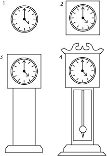
This one is really easy, but the scroll work at the top of the grandfather clock may challenge you. I’ll explain how to draw those lines at the end. OK, can you count how many lines added to our original clock face it will be to create this symbol? If you counted 33 you’re right. What?! Yes, there really is that many. We’ll count them on the way.
OK, first simply draw a square and place it behind the clock face – that’s 4 lines. Now draw two vertical lines for the case – two more lines for a total of 6. The base of the grandfather clock is a rectangle but you can see that each side is angled a bit. The best way (or at least I think so) is to draw a rectangle to a width of your liking. Add two anchors on each side directly in the middle of the edge lines. Now select the top two corner anchors and scoot them in toward each other a few pixels. If you’re counting, that is actually 6 more lines added to our total we now have 12.
Next, draw a vertical rectangle slightly smaller than the body or the ‘tower’ of the grandfather clock. This will represent the glass door – 4 lines + 12 = 16. There is a couple ways of drawing the pendulum. I drew a long slender vertical rectangle, added an anchor in the center of the bottom line and then pulled it down to a point. The shape is actually 5 ines, but I’m not counting the top line as it shares the top line of the rectangle for the glass door…so it’s only 4 lines – and we’re up to 20. Draw a circle and place it somewhere at the bottom of the of the pendulum – 1 line. 21 lines so far.
The crown is 12 lines itself. If you’re keeping tabs, 12 + 21 = our 33 lines we said would be in this symbol. I’ve expanded the crown below to show each line and its relationship. The crown is really two halves of the same thing. The red dashed box focuses on one half and once its complete, simply copy and paste, and flip it horizontal. Then join the two halves together. If you study you’ll see there are only two curve lines – one is an “S” shape and the other is sort of a lazy “C” lying on its side. The remaining lines are straight and connect them all togehter. Once you get this completed just place it on top of the very first square you drew using its top line as the crown’s bottom line. Grand Dad would be proud!

In summary, I am hoping the creative spirit in you is sparked that by starting with a simple recognizable image, you can reproduce it in many different ways to communicate your message. If you can remember this simple phrase:
An object is a shape that occupies a space.
In the above examples, a clock is not a clock at first; it is a shape, a circle. By adding dots, dashes, and lines we create a visualization that the shape now appears to be a recognizable object. That object occupying a space is where you place it and how light reflects off of it. In some future lesson I’ll go in depth further on perspective and how lights and darks can really define an object even more.
Fundamentally, just remember you don’t have to be an artist. All you need is some creativity and the ability to “see” shapes in your objects and you can draw just about anything. Promise!

[…] communication and how you can capitalize on some very simple yet effective techniques. This post dots, dashes, and lines] explains some of these […]