This next step in the Sketchnote School series is a continuation from last week about preparing to sketchnote. You may be saying to yourself, “Self, isn’t preparing and format the same thing?” Well, yes…sort of. Format in this context is more about how your sketchonte reads rather than the physical shape and size. We’ll look at format as it relates to paper choice and sketchbook sizes in the materials section later in this post.
Before we dive in, remember that sketchnoting is a craft and a skill to help you the individual retain information by visual notetaking. Your notes are yours and personal to you. Sharing them publicly is an upward trend, that I’d encourage you to participate so others can either be inspired by your style or you get constructive feedback to become better.
FORMAT:
Think of format on how you would lay out a document structure before writing. If possible, try to decide how you’d like your sketchnote to read before the talk starts. Whether it be like traditional western hemisphere reading from left-to-right and top-to-bottom or some variation. There is no rule. If you are just starting out it might be more comfortable to go with a standard header row and a few columns.
In my sketchnote of Diana Nyad’s recent epic swim it’s a simple header with three columns. The header reads left-to-right with the ‘swimmer’ going in the direction to the left draws your eyes back to the left side of the page. From there a column with a list of her swim attempts pushes the eye down the page ending with her logo. The center column is wider than the flanking columns with a visual representation of the swim and a map outline of Cuba and the Florida Keys accompanied with some statistics of the swim. Finally, the right column is a collection of some of her quotes from interviews. The format? Header with three columns.
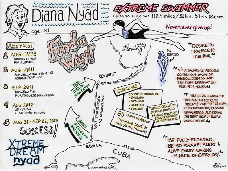
The header with columns is probably the most comfortable and easiest because most documents read this way. Think of your format as a way to set up the hierarchy of the expected talk. As discussed last week during your 10-15 minutes prior to the talk, use a pencil and draw some light guidelines to break your page into a format. Once your sketchonte is completed just erase the light pencil guidelines. You’ll get the hang of it the more you practice.
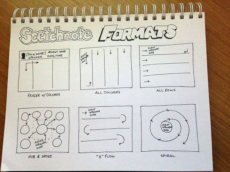
Since sketchnoting is truly a creative process, there are no rules on how a page needs to be formatted yet some common formats are:
- Header w/ columns
- All columns
- All rows
- Hub & Spoke
- “S” flow
- Spiral
FLOW:
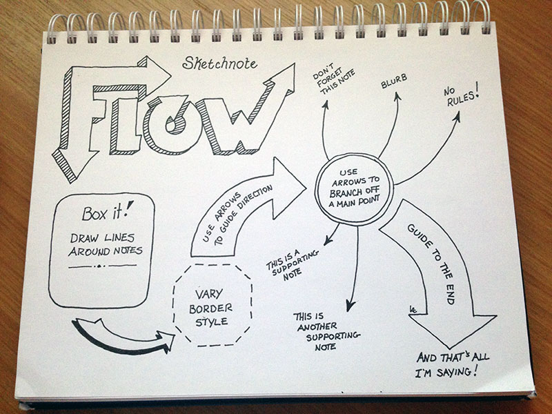
Visual flow ties directly into format. Sometimes information is flying in so fast and while trying to keep up your format gets all wonky. You may have started with the intention of a simple column format may end up looking all scattered. Keeping things in a logical flow during live sketchnoting is something that just takes practice. To aid in keeping your notes in a somewhat legible reading and visual flow, the simplest tip aside from guidelines are lines and arrows.
If your sketchnotes seem to be running amuck and getting tossed around, draw simple lines as separators to divide content or lines around key concepts. If those high points have a logical flow, draw arrows to connect them so when you revisit your sketchnote you will be able to understand your thoughts at the time.
MATERIALS:
Ever go to your favorite store and want to take home the entire inventory? Yeah, that’s me in my local art supply store! This is a big section of this post because having the right tools ultimately contributes to your experience. Ever try flipping a pancake with a hammer? Didn’t think so.
First, there is no such thing as the “right” materials.Your favorite tools come with time and practice on what works best for you and what you’re most comfortable with. I’ve learned over the years that my favorite hammer for flipping pancakes…I mean, my favorite pen may not flow as well on some paper and my favorite paper may not be the best for some pens. It’s really a trial and error method until you end up with the best fit for your style and comfort.
PENS:
You know when you go to a conference expo and you come home with 357 pens from vendor’s booths? Yeah, that. Well, that ‘issue’ resulted in a multitude of various pen/pencil holders on my drawing table. Hi, my name is Kevin and I’m a pen hoarder.

Worse, you know that pen you let someone borrow and it’s not until later in the day you realize you’re missing it? Yeah, I’m that other guy, too. Sorry. I had an intervention though, and working hard at curbing the addiction of having a pen collection. All I remember from those withdrawal days is carrying a file size cardboard box full of pens to the Goodwill store. Then went to my local hardware store and rummaged through their scrap PVC pipe and picked up a couple feet of 2” diameter thin-wall pieces. Cut them all to an equal six inch length and cut out a stand from cardboard. For less than $10 I got organized!
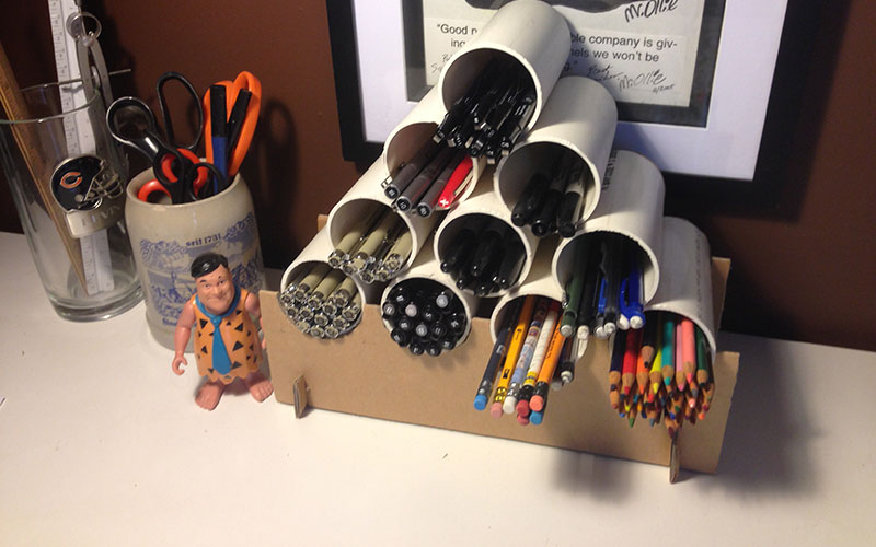
</end confession>
I digress…
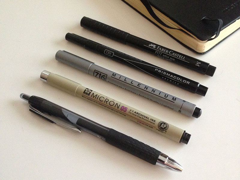
Here’s a selection of my current art pens (below image) not to be confused with conference schwag pens. I use them for a variety of purposes and I’ll choose one over the other depending on which sketchbook I use. I know…nuts, right?! From top to bottom they are:
- Faber Castel PITT artist pen
- Prismacolor Premier
- ZIG Millennium
- Micron
- Uni-ball Signo Gel Pen
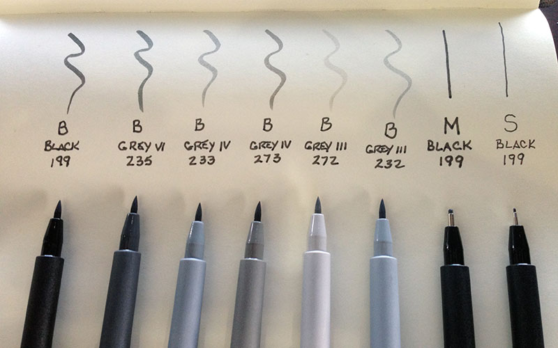
Faber-Castell PITT pens and Prismacolor Markers have a huge variety of colors, too. I just recently picked up (image below) this set of Faber-Castell Manga PITT Greytone Brush pens. I’m eager to try them out to give a little depth to my sketchnotes!
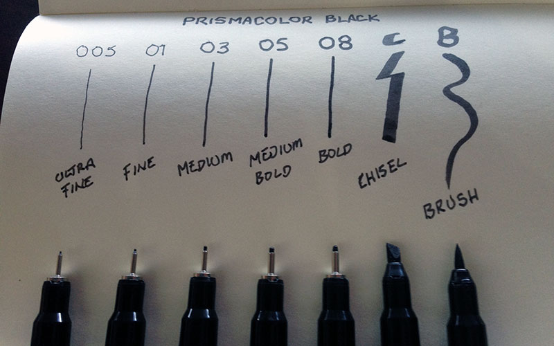
Prismacolor Premiere Black Markers are my favorite for larger drawings and filling in shapes. Probably because they’re referred to as markers rather than pens. They’re a bit more expensive than the others, but they don’t leak or bleed as much and I really like the precision of the Chisel tip. Plus, as the name Prismacolor suggests, this brand has a huge selection of colors.
The ZIG Millennium has a nice flow, inexpensive, several colors, and are readily available just about anywhere. The Micron is by far one of the best all around and versatile pens. You can buy these in multi-packs with the same tip size if you do a lot of pen work. The tips do wear out usually before the ink runs out.
Gel Pens. What can I say about gel pens other than they are great for the price at around $1 each and sold just about everywhere. Depending on paper choice the ink tends to bleed but not that bad. Gel ink does not dry as fast as marker pens so be careful about smudges. If you’re anything like me where I lose or misplace pens all the time you can’t beat these for the disposable price. My current favorite is the Uni-ball Signo Gel 207.
SKETCHBOOKS and PAPER:
You know that pen problem I used to have? Now I need a sketchbook intervention!
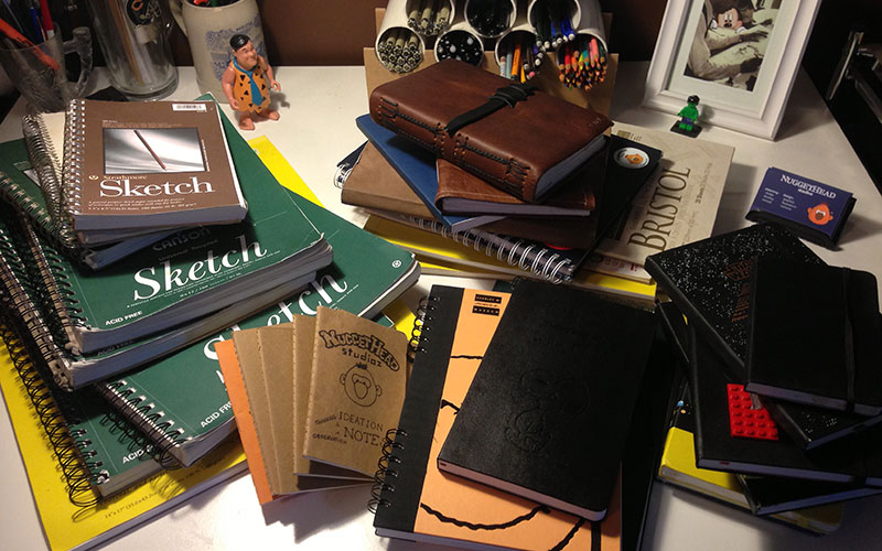
There’s nothing worse than a bleeding note (ink spreads through the fibers of the paper) or ink that doesn’t dry fast enough where you end up smudging it. Paper weight can play a big part in the type of pen you use.
For reference, typical paper one would find in a printer is usually rated at 20 lbs. (U.S.) referred to as 20-pound-paper or simply 20# paper. Without getting too technical, the weight of the paper refers to 500 standard 17” x 22” sheets (ream) of paper. This size can then be cut into four 8 ½” x 11” sheets of paper we typically use in a printer. So, 20 lbs. (or 20#) is the weight of one ream of paper.
That all said, there are different weights of paper and those weights determine how ink flows. There is a bunch of other stuff like bond, fibers, raw material, etc. but for simplicity we’ll just talk about basic sketchbook paper. I find that any sketchbook with a weight of around 60 – 70 lbs. is just about the middle ground that works best for all pens. There are heavier weights like that of Bristol board or Watercolor paper at 100 – 140 lbs. but unless you’re doing serious finish work save your money.
The type and size of a sketchbook is also a concern depending on your comfort level. I rotate between three sizes: My go-to size is the Moleskine Classic (avg. 5” x 8.25”) size. It’s small enough to be versatile yet still a decent size where I don’t feel crowded. For those times when I’m not carrying other gear or going to be out a long time I carry a softcover Cahier size at 3.5” x 5.5” that fits in pants or shirt pocket. My conference sketchbook is a standard 8 1/2” x 11” spiral bound with tear out pages. Large enough to give you room, hard cover for stability, and the spiral bound so I can work flat without the ‘binder bend’ of other styles.
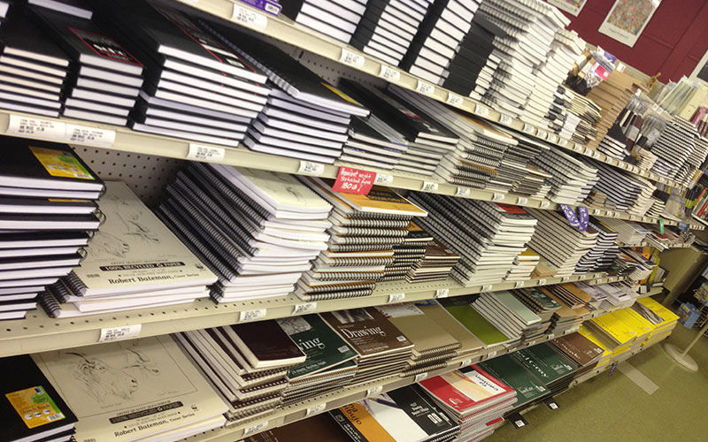
Swing by your local art store if you live near one and take a few moments to study the selection of sketchbooks. If you don’t live near an art store, big bookstores such as Barnes & Noble or Books-A-Million have a sketchbook/journal section. If you don’t have access to any of those, most big box retailers such as Office Depot, Target, WalMart, Office Max and others usually carry a brand or two of popular sketchbooks. Or, visit DickBlick.com and shop until your heart’s content! While DickBlick will mostly likely beat any price it’s best to touch/feel the sketchbook to see if it “fits” you and you like the paper weight. Aside from Moleskine, other brands I use are Strathmore, Canson, and Bienfang which are all reasonably priced and good quality.
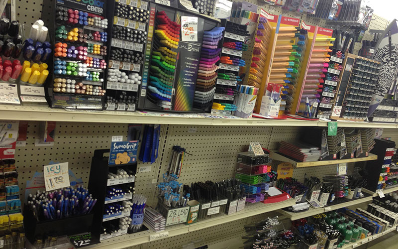
Another reason to go to an art supply store is to test pens. Art stores typically have scratch pads near all the pens so you can test a pens flow before buying. Once you find the tools and materials that you like best, then fill your basket!
There’s a lot more we can talk about, but for the sake of a marathon post let’s end it here.
*****
ASSIGNMENT:
I’ll go easy on you this week for being a few days behind getting this out. Your homework is to go shopping. Yes, shopping! I removed myself from any liability from anyone spending more than their sketchnote tools allowance. What? Am I the only one with an imposed allowance?
Seriously, take some time to visit the various links to the pens and sketchbooks above. In your normal shopping and errands swing by an office supply store at a minimum and look at the pens beyond just writing utensils.
Shoot me an email or find me on Twitter if you have specific questions and I’d be happy to help. I’d be interested to hear if this information was helpful or if you can think of anything I may have forgotten to mention related to Format, Flow, and Materials. If so, take a moment to comment.
*****
Introduction – 6 Steps to Great Conference Sketchnotes.
STEP 1 – Preparing: Live sketching or Post-sketching?
STEP 2 – Preparing: Format, Visual Flow, and Materials. [You Are Here]
STEP 3 – Characters and Locations: Who and where?
STEP 4 – Text and Dialogue: Headers, Titles, Captions, and Speech bubbles.
Wish I could attend the DevLearn session but this Sketchnote school is great. Lots of detail and pics. I’ve yet to really go pen shopping but I’ve found a simple Papermate felt tip works well for me, and I have a Micron for back up, which has replaced by fine point Sharpie since it doesn’t bleed through the paper. Though the Micron doesn’t bleed through, any of the pens that I use to add color usually do (Copic).
Great idea for pen storage. I’m overloaded with writing/coloring implements between keeping my kid stocked w. markers/crayons/color pencils, having things for dry erase (pencils, markers, and crayons), and my own markers for sketchnoting (small) and graphic recording (large), much less being able to put my hands on a regular old pen or pencil in order to write something down.
Hi Coniqua!
I just picked up a package of Papermate Flair felt tip pens in their new Vivid Color multi-pack of 6. I like Flair pens for quick work, but find their tips wear out too fast and end up getting a wider line weight than a new Flair out of the package.
You can’t go wrong with a Micron. A bit more pricey per pen but as they way, “you get what you pay for” and Microns are the chosen favorite for a lot of artists. As for Copic pens, that’s the one brand I’ve not yet tried.
After this series I will do a post on how to make those pen/pencil holders.